Dene Lodge Dental
Dene Lodge Dental Practice, one of the oldest practices in Guildford, they haven’t updated their website/brand since the 90s. They would like to appeal to a much younger audience and still keep their loyal old customers.
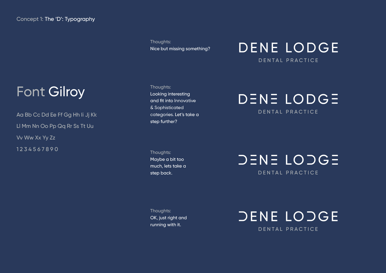
Branding Concept 1
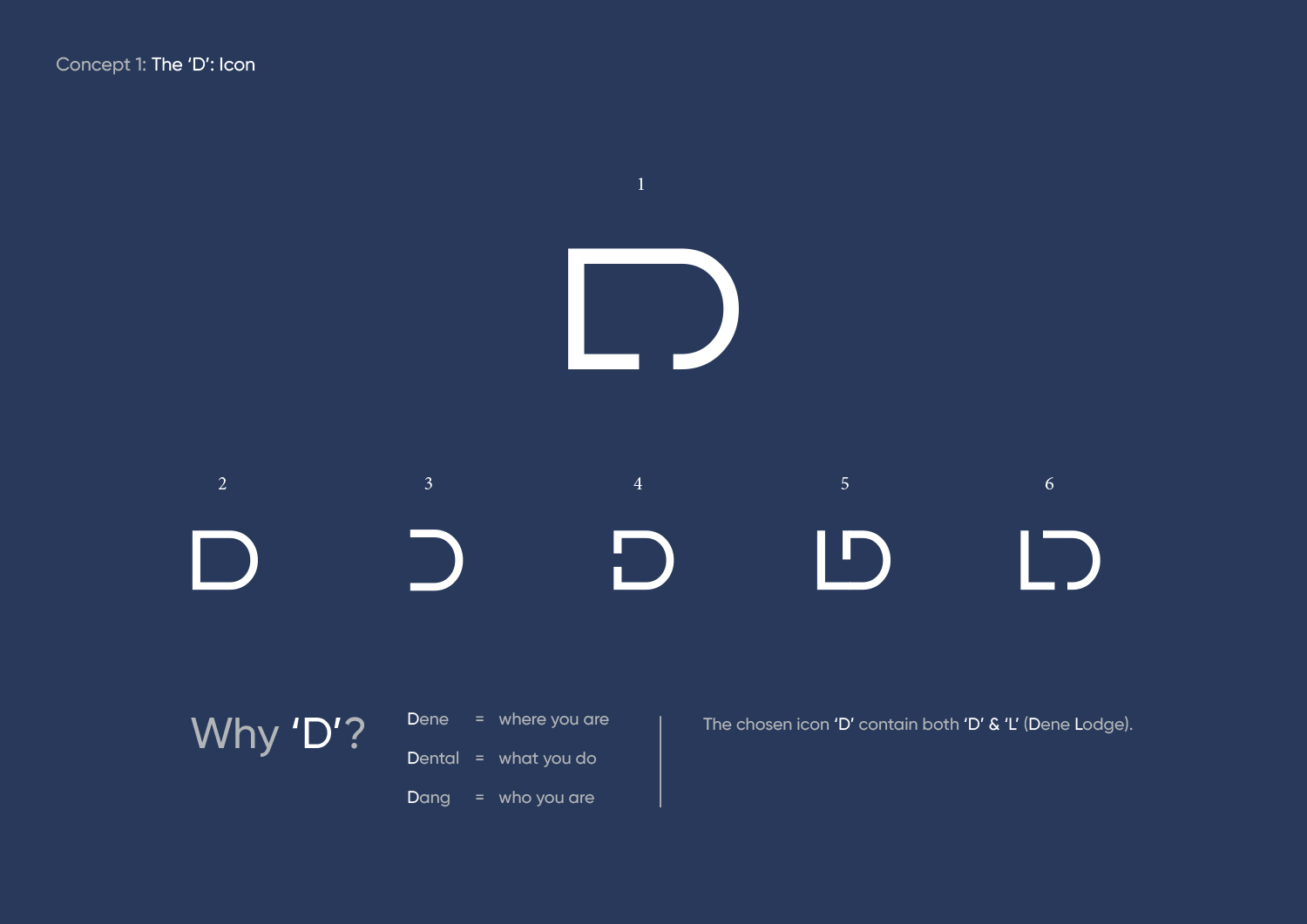
Why ‘D’?
The chosen icon ‘D’ contain both ‘D’ & ‘L’ (Dene Lodge).
Dene = where you are
Dental = what you do
Dang = who you are
Branding Concept 2
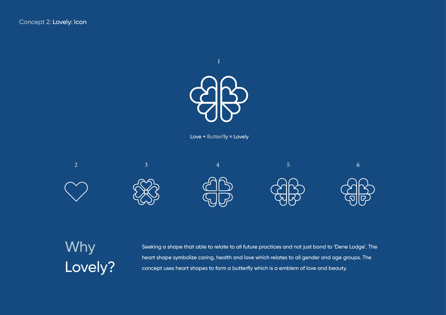
Why Lovely?
Seeking a shape that able to relate to all future practices and not just bond to ‘Dene Lodge’. The heart shape symbolize caring, health and love which relates to all gender and age groups. The concept uses heart shapes to form a butterfly which is a emblem of love and beauty.
Branding Concept 3
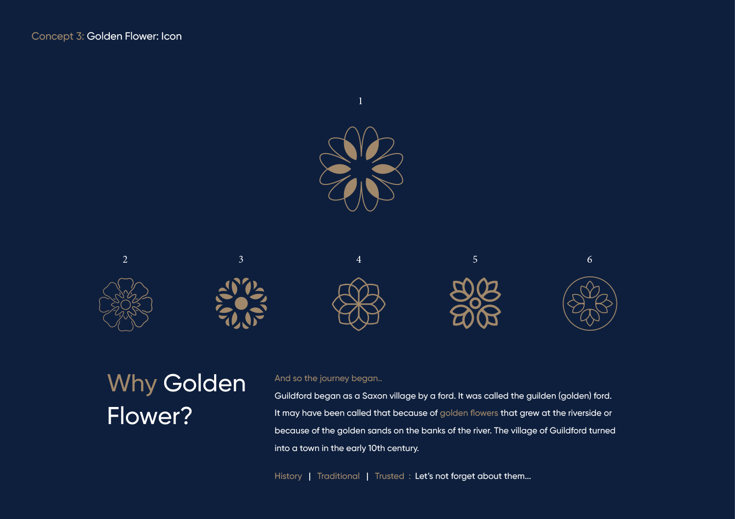
Why Golden Flower?
And so the journey began..
Guildford began as a Saxon village by a ford. It was called the guilden (golden) ford. It may have been called that because of golden flowers that grew at the riverside or because of the golden sands on the banks of the river. The village of Guildford turned into a town in the early 10th century.
History | Traditional | Trusted : Let’s not forget about them…
Website Design


